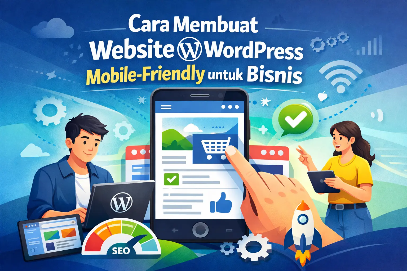
60% Pengunjung Buka dari HP — Kamu Sambut Mereka dengan Website yang Berantakan?
Mengapa Website WordPress Mobile-Friendly Itu Critical untuk Bisnis
Mobile-friendly bukan lagi “nice to have” — ini adalah minimum requirement.
Alasan bisnis:
- 60-70% traffic dari mobile device
- Google prioritaskan mobile-friendly sites di search ranking
- Conversion rate mobile bisa sama tinggi dengan desktop — jika experiencenya bagus
- First impression matters — website berantakan di mobile = unprofessional
Alasan teknis:
- Google menggunakan mobile-first indexing sejak 2019
- Website yang tidak mobile-friendly di-penalty di SEO
- User experience buruk = bounce rate tinggi = ranking turun
Untuk bisnis profesional seperti firma hukum, konsultan, atau B2B services, calon klien sering browse di mobile dulu sebelum follow-up di desktop. Jika first impression di mobile buruk, mereka tidak akan kembali.
Sama seperti pentingnya menjaga website tetap cepat, memastikan website mobile-friendly adalah bagian dari infrastruktur digital yang proper.
Cara Cek Apakah Website WordPress Anda Mobile-Friendly
Sebelum fix, kita perlu tahu dulu seberapa parah masalahnya.
Metode 1: Google Mobile-Friendly Test (Paling Akurat)
Ini tool resmi dari Google — gratis dan mudah.
Langkah:
- Buka Google Mobile-Friendly Test
- Masukkan URL website Anda
- Klik “Test URL”
- Tunggu 30-60 detik untuk hasil
Cara baca hasil:
- “Page is mobile-friendly” = Anda aman (tapi tetap cek detail)
- “Page is not mobile-friendly” = Ada masalah yang harus diperbaiki
Google akan kasih breakdown masalah spesifik seperti:
- Text too small to read
- Clickable elements too close together
- Content wider than screen
- Viewport not set
Screenshot hasil test ini dan simpan sebagai benchmark.
Metode 2: Test Manual di Device Nyata
Tool bagus, tapi nothing beats testing di device asli.
Yang perlu dicek:
- Buka website di smartphone Anda (Android & iOS jika ada)
- Test di berbagai browser (Chrome, Safari, Firefox)
- Cek semua halaman penting: homepage, about, services, contact
- Try klik semua button dan link
- Test form submission jika ada
Red flags yang harus dicatat:
- Harus zoom in/out untuk baca text
- Button terlalu kecil atau susah diklik
- Gambar keluar dari layar atau terpotong
- Menu tidak bisa dibuka atau berantakan
- Loading terlalu lama (> 3 detik)
Metode 3: Chrome DevTools (untuk Preview Cepat)
Untuk founder yang sering edit website, ini cara paling praktis.
Langkah:
- Buka website di Chrome
- Klik kanan → Inspect (atau tekan F12)
- Klik icon “Toggle device toolbar” (atau Ctrl+Shift+M)
- Pilih device: iPhone, Samsung Galaxy, atau custom size
- Refresh halaman
Ini bukan test sempurna tapi bagus untuk quick check sebelum publish changes.
Problem Umum Website WordPress di Mobile (dan Cara Fix-nya)
Mari kita tackle masalah paling sering terjadi satu per satu.
Problem 1: Text Terlalu Kecil untuk Dibaca
Gejala:
- Font size di bawah 16px di mobile
- User harus zoom in untuk baca konten
- Paragraf terlihat cramped
Solusi:
A. Via Theme Customizer (Cara Termudah)
- Login ke WordPress Dashboard
- Masuk ke Appearance → Customize
- Cari section Typography atau Mobile Settings
- Set minimum font size: 16px untuk body text
- Set line height: 1.5 – 1.7 untuk readability
- Klik Publish
B. Via Custom CSS (Jika Theme Tidak Punya Option)
Masuk ke Appearance → Customize → Additional CSS, paste kode ini:
/* Mobile Typography Fix */
@media (max-width: 768px) {
body {
font-size: 16px !important;
line-height: 1.6 !important;
}

h1 {
font-size: 28px !important;
}

h2 {
font-size: 24px !important;
}

h3 {
font-size: 20px !important;
}

p {
font-size: 16px !important;
margin-bottom: 20px !important;
}
}
Klik Publish dan test hasilnya di mobile.
Problem 2: Button dan Link Terlalu Kecil atau Terlalu Dekat
Gejala:
- Sulit klik button CTA
- Accidentally klik link yang salah
- Form submit button terlalu kecil
Solusi:
Google merekomendasikan touch target minimal 48×48 pixels.
Via Custom CSS:
/* Mobile Button & Link Fix */
@media (max-width: 768px) {
  /* Make all buttons bigger */
  .button,
  .btn,
  input[type="submit"],
  button {
    min-height: 48px !important;
    min-width: 120px !important;
    padding: 12px 24px !important;
    font-size: 16px !important;
    margin: 10px 0 !important;
  }

  /* Add spacing between clickable elements */
  a {
    padding: 8px 0 !important;
    display: inline-block !important;
  }

  /* Menu items spacing */
  .menu-item {
    margin: 8px 0 !important;
  }
}
Pro tip: Test dengan “fat finger test” — coba klik semua button dengan ibu jari. Kalau gampang, ukurannya sudah pas.
Problem 3: Content Lebih Lebar dari Layar
Gejala:
- Harus scroll horizontal untuk baca
- Gambar atau tabel keluar dari layar
- Layout berantakan
Solusi:
A. Fix Viewport Meta Tag
Cek file header.php theme Anda (via Appearance → Theme File Editor). Pastikan ada kode ini di dalam <head>:
<meta name="viewport" content="width=device-width, initial-scale=1.0">Jika tidak ada, tambahkan. Ini memberitahu browser untuk adjust content sesuai lebar screen.
B. Fix Images yang Overflow
Tambah CSS ini:
/* Responsive Images Fix */
@media (max-width: 768px) {
  img {
    max-width: 100% !important;
    height: auto !important;
  }

  /* Fix embedded videos */
  iframe,
  embed,
  object {
    max-width: 100% !important;
  }

  /* Fix tables */
  table {
    width: 100% !important;
    display: block !important;
    overflow-x: auto !important;
  }
}
C. Fix Fixed Width Elements
Hindari hard-coded width di HTML. Ganti:
<div style=”width: 800px”> dengan <div style="width: 100%; max-width: 800px">
Problem 4: Menu Navigasi Tidak Mobile-Friendly
Gejala:
- Desktop menu tampil mentah di mobile
- Dropdown tidak berfungsi
- Menu items terlalu banyak dan cramped
Solusi:
Sebagian besar theme modern sudah punya hamburger menu untuk mobile. Jika theme Anda tidak punya:
Option A: Install Plugin Responsive Menu
- Install plugin WP Mobile Menu
- Activate
- Masuk ke Settings → Mobile Menu
- Pilih menu yang mau ditampilkan
- Customize tampilan (color, icon, position)
- Save
Plugin ini otomatis ganti desktop menu dengan hamburger menu di mobile.
Option B: Manual CSS (Advanced)
Jika mau control penuh, gunakan CSS ini:
/* Hide desktop menu on mobile */
@media (max-width: 768px) {
  .main-navigation {
    display: none;
  }

  /* Show mobile menu toggle */
  .mobile-menu-toggle {
    display: block !important;
  }
}
Tapi ini butuh JavaScript untuk hamburger functionality. Lebih mudah pakai plugin.
Problem 5: Form Tidak User-Friendly di Mobile
Gejala:
- Input fields terlalu kecil
- Submit button sulit diklik
- Keyboard overlap dengan form
- Autofill tidak berfungsi
Solusi:
/* Mobile Form Optimization */
@media (max-width: 768px) {
  /* Make input fields bigger */
  input[type="text"],
  input[type="email"],
  input[type="tel"],
  textarea,
  select {
    width: 100% !important;
    min-height: 48px !important;
    font-size: 16px !important;
    padding: 12px !important;
    margin-bottom: 15px !important;
  }

  /* Make labels clear */
  label {
    font-size: 14px !important;
    font-weight: 600 !important;
    margin-bottom: 8px !important;
    display: block !important;
  }

  /* Submit button */
  input[type="submit"],
  button[type="submit"] {
    width: 100% !important;
    min-height: 50px !important;
    font-size: 18px !important;
    margin-top: 20px !important;
  }
}
Best practice:
- Font size minimal 16px untuk prevent iOS auto-zoom
- Full-width input lebih mudah tap
- Add appropriate input types:
type="email",type="tel"untuk trigger keyboard yang tepat
Sama pentingnya dengan memastikan form kontak Anda berfungsi dengan baik, tampilan mobile-friendly membuat form lebih mudah diisi.
Strategi Advanced: Optimasi Mobile Experience Beyond Basics
Setelah basics sudah oke, mari naikkan level.
1. Implement Mobile-Specific CTA
Desktop dan mobile punya behavior berbeda. Di mobile, “Call Now” button lebih effective daripada “Contact Us Form.”
Implementasi:
/* Show call button only on mobile */
.mobile-only-cta {
  display: none;
}

@media (max-width: 768px) {
  .mobile-only-cta {
    display: block !important;
    position: fixed;
    bottom: 20px;
    left: 50%;
    transform: translateX(-50%);
    z-index: 999;
  }

  .call-now-btn {
    background: #25D366; /* WhatsApp green */
    color: white;
    padding: 15px 30px;
    border-radius: 50px;
    font-size: 18px;
    font-weight: bold;
    box-shadow: 0 4px 12px rgba(0,0,0,0.3);
  }
}
2. Optimize Images untuk Mobile
Images adalah salah satu penyebab terbesar website lambat di mobile.
Best practice:
- Use WebP format (lebih ringan 30-50%)
- Lazy loading untuk images below the fold
- Serve different image sizes untuk desktop vs mobile
Plugin recommended:
- ShortPixel atau Imagify untuk compression
- Smush atau Optimole untuk lazy loading
3. Reduce Tap-to-Click Delay
iOS Safari punya 300ms delay untuk detect double-tap zoom. Fix ini:
Tambah di <head>:
<meta name="viewport" content="width=device-width, initial-scale=1.0, maximum-scale=1.0, user-scalable=no">Dan CSS:
* {
  touch-action: manipulation;
}
Ini membuat button response lebih cepat.
4. Implement Sticky Header atau Sticky CTA
Di mobile, scroll panjang. Sticky element membantu user navigate.
/* Sticky header for mobile */
@media (max-width: 768px) {
  .site-header {
    position: sticky;
    top: 0;
    z-index: 999;
    background: white;
    box-shadow: 0 2px 8px rgba(0,0,0,0.1);
  }
}
Plugin WordPress untuk Mobile Optimization
Jika manual coding terlalu teknis, gunakan plugin ini:
1. AMP (Accelerated Mobile Pages)
Kegunaan: Buat versi ultra-fast dari halaman WordPress Anda
Pros:
- Loading sangat cepat di mobile
- Google prioritaskan AMP pages
- Gratis dan official dari Google
Cons:
- Limited design customization
- Beberapa plugin tidak compatible
Install: Official AMP Plugin
2. WPtouch
Kegunaan: Automatically create mobile-friendly version of your site
Pros:
- Easy setup, no coding needed
- Multiple mobile themes
- Analytics integration
Cons:
- Free version limited
- Separate mobile site (not responsive)
3. Jetpack Mobile Theme
Kegunaan: Part of Jetpack suite, enable mobile-friendly theme
Pros:
- From Automattic (WordPress creator)
- Integrated dengan Jetpack features
- Free
Cons:
- Butuh install full Jetpack (berat)
- Limited customization
Rekomendasi saya: Jika theme Anda sudah responsive, tidak perlu plugin tambahan. Fix manual dengan CSS lebih clean. Plugin hanya jika theme benar-benar outdated dan tidak responsive.
Testing dan Monitoring Mobile Performance
Setelah implement fixes, jangan berhenti di situ. Monitor terus.
Tools untuk Ongoing Monitoring
1. Google Search Console
- Gratis
- Masuk ke Mobile Usability Report
- Lihat apakah ada error mobile-friendly
- Get notified jika ada masalah baru
2. Google Analytics
- Cek Audience → Mobile → Overview
- Bandingkan bounce rate desktop vs mobile
- Jika mobile bounce rate > 10% dari desktop, ada masalah UX
3. PageSpeed Insights
- Test mobile performance
- Kasih recommendations spesifik
- Monitor Core Web Vitals
Sama seperti pentingnya monitoring uptime website, monitor mobile performance secara berkala juga critical.
Benchmarks yang Harus Dicapai
Mobile-Friendly Metrics:
- Google Mobile-Friendly Test: PASS
- Font size body text: ≥ 16px
- Touch targets: ≥ 48x48px
- Tap-to-click delay: < 100ms
- Content fits screen: No horizontal scroll
Performance Metrics:
- Mobile page load: < 3 seconds
- First Contentful Paint: < 1.8s
- Largest Contentful Paint: < 2.5s
- Cumulative Layout Shift: < 0.1
Jika semua metrics ini tercapai, mobile experience Anda sudah top-tier.
Kesalahan Umum yang Harus Dihindari
1. Assume Theme Responsive = Mobile-Friendly Theme claim “responsive” tapi execution-nya buruk. Always test.
2. Design untuk Desktop First Seharusnya mobile-first design. Design untuk mobile dulu, baru scale up ke desktop.
3. Ignore Load Time di Mobile Network Test di WiFi cepat ≠ test di 4G atau 3G. Use Chrome DevTools untuk throttle network speed.
4. Popup yang Aggressive di Mobile Google penalty popup yang block content di mobile. Jika pakai popup, pastikan:
- Muncul setelah user scroll 50%+
- Mudah di-close
- Tidak full-screen
5. Fix One-Time, Forget Forever Mobile landscape terus berubah. Review mobile experience setiap 3-6 bulan.
Checklist: Website WordPress Mobile-Friendly
Gunakan checklist ini untuk final check:
Visual & Layout:
- Text readable tanpa zoom (≥16px)
- No horizontal scrolling
- Images fit dalam screen
- Spacing adequate antara elements
- Consistent layout di berbagai screen sizes
Navigation:
- Menu mudah diakses (hamburger menu works)
- Button dan link gampang diklik (≥48x48px)
- Breadcrumb jelas (jika ada)
- Back to top button (untuk long page)
Forms:
- Input fields cukup besar
- Labels jelas
- Submit button prominent
- Autofill enabled
- Error messages jelas
Performance:
- Load time < 3 seconds
- Images optimized
- No unnecessary plugins loaded
- Lazy loading aktif
SEO & Technical:
- Viewport meta tag set correctly
- Google Mobile-Friendly Test: PASS
- No mobile-specific errors di Search Console
- Structured data works di mobile
Maintenance: Keep Your WordPress Mobile-Friendly Long-Term
Mobile optimization bukan one-time task.
Monthly tasks:
- Test website di mobile device
- Check Google Search Console untuk mobile errors
- Review bounce rate mobile vs desktop
Quarterly tasks:
- Run full audit dengan Google Mobile-Friendly Test
- Update WordPress dan plugins (bisa affect mobile display)
- Review mobile user feedback
Yearly tasks:
- Consider redesign jika metrics turun consistent
- Evaluate new mobile trends dan implement yang relevan
- Check apakah theme masih modern atau perlu ganti
Ingat, website adalah aset bisnis yang butuh maintenance rutin, termasuk aspek mobile-nya.
Penutup
Website WordPress mobile-friendly bukan luxury — ini necessity.
Dengan 60-70% traffic datang dari mobile, mengabaikan mobile experience sama dengan menutup pintu untuk mayoritas calon klien potensial.
Kabar baiknya: Membuat website WordPress mobile-friendly tidak memerlukan rebuild total. Dengan fixes yang targeted dan systematic seperti yang sudah kita bahas, Anda bisa transform mobile experience dalam hitungan jam, bukan minggu.
Mulai dari test, identify masalah spesifik, apply fixes satu per satu, dan monitor hasilnya.
Website yang welcome 100% pengunjung — baik dari desktop maupun mobile — adalah website yang siap growth.
Untuk bantuan lebih lanjut mengoptimalkan website WordPress Anda atau memastikan semua aspek teknis berjalan optimal, tim BWP siap membantu.
FAQ
Tidak. Pendekatan modern adalah responsive design — satu website yang adapt ke semua screen sizes. Ini lebih mudah maintain dan lebih SEO-friendly. Separate mobile site (m.domain.com) sudah outdated.
“Responsive” tidak selalu berarti “mobile-optimized.” Banyak theme responsive tapi punya masalah seperti font terlalu kecil, button terlalu rapat, atau load time lambat. Selalu test dan customize.
Tergantung severity masalah. Untuk minor fixes (font size, button size, spacing), bisa selesai dalam 2-3 jam. Untuk overhaul lebih besar, bisa 1-2 hari. Tapi impact-nya immediate dan lasting.
Sangat. Google menggunakan mobile-first indexing sejak 2019. Artinya Google crawl dan rank berdasarkan mobile version website Anda. Website yang tidak mobile-friendly akan di-penalty di search results.
Mobile-friendly = website bisa diakses dengan baik di mobile. Mobile-first design = design process dimulai dari mobile dulu, baru scale up ke desktop. Mobile-first adalah best practice modern, tapi mobile-friendly adalah minimum requirement.